Physics 50
Module 1
Harvey Mudd College
Week 4: Communicating written scientific results, physics-style
While talks, podcasts and videos are all wonderfully rich formats for sharing scientific results, in physics and many other scientific disciplines, the golden standard for communication is a published journal article, or “paper” for short. The physics article is typically composed of (1) a short abstract summarizing the main findings, (2) the main body of the paper, including figures, and (3) a bibliography to help contextualize the results within the broader field of research.
But what if you just don’t have the time to read all those parts of each article you need to check out? The neat trick for quickly scanning physics papers also works as a fantastic method for writing your own paper: focus on the figures. A good rule of thumb is that if you “read” every figure+caption, you should get the gist of the main conclusions of the paper, as well as a sense of how those results were determined. In fact, the sequence of figures+captions acts a lot like an outline you may have produced in Writ 001, in that it conveys the main result (thesis) by showing evidence in support of a sequence of subclaims. The evidence is usually shown directly in the figure, using either a plot with data points or an image of the system studied. The analysis of that evidence is ideally concisely summarized in the figure captions.
In Physics 50, you will ultimately get to experience what it’s like to create a sequence of figures with captions that would provide the backbone to a physics paper. The first step in that process is to learn how to create a single figure with a caption. For the Module 1 deliverable, you will produce a figure containing a plot, and later in this course you will also create figures that don’t contain a plot. Both types of figures are essential for communicating your scientific results.
A figure showing a plot
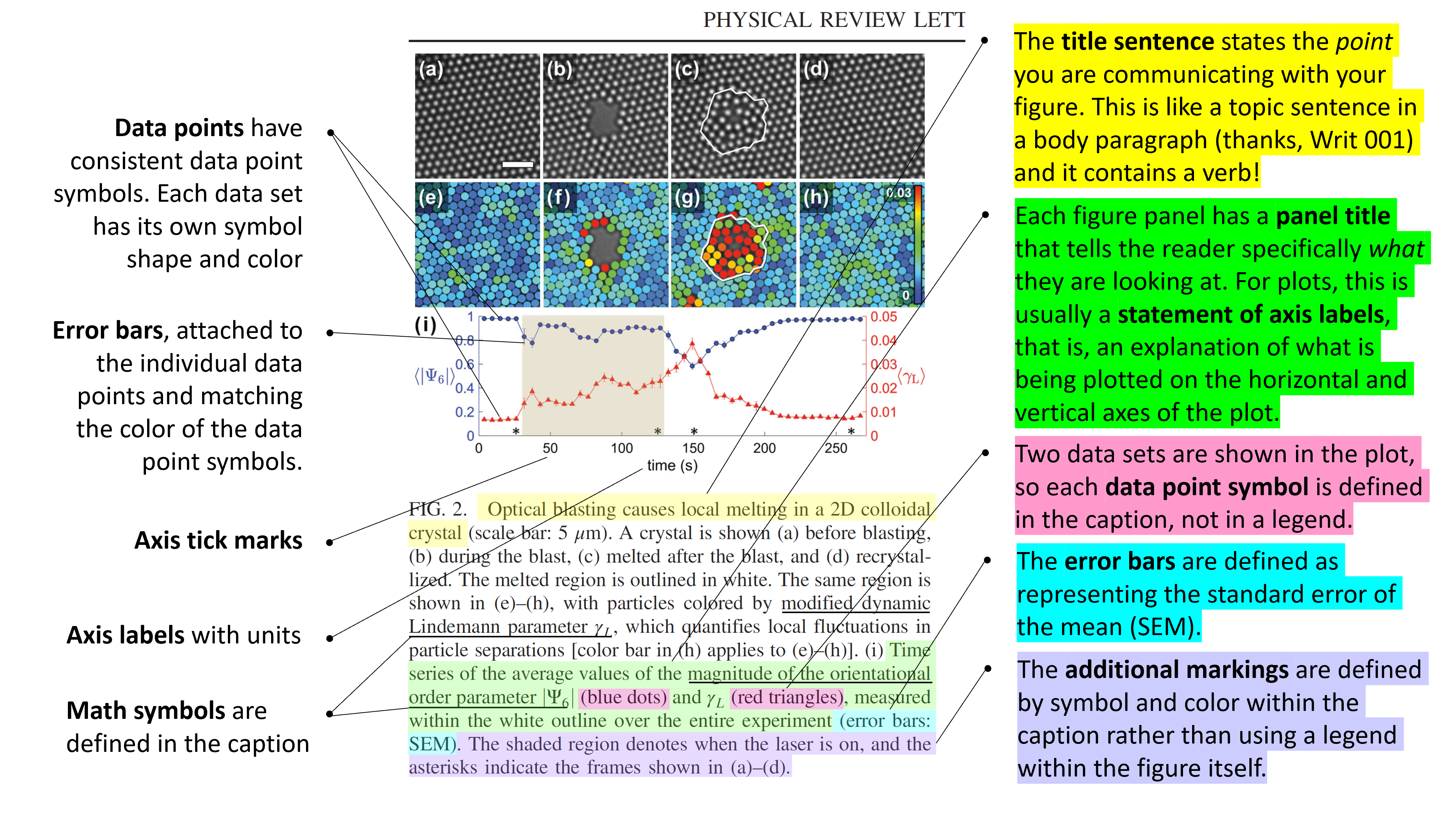
The most common way to present experimental data is to show a plot, usually with two axes and clearly marked data points with error bars. Most readers will expect to see the main experimental result expressed using a plot – in fact this is so universal that physicists often refer to the central figure of their publication as “the money plot”!
The fundamental elements that a figure with a plot needs to be effective are:
In the figure itself
-
Axes, with axis labels, units, and tick marks in a font that is as big as the text in the caption and surrounding paragraphs. It is okay to label an axis using a mathematical symbol for a variable, as long as the symbol is defined with words in the caption.
-
Data points, with consistent data point symbols. If there is more than one data set in the plot, each data set should have its own symbol shape and color. These are typically described in the caption, not using a legend.
-
Error bars, attached to the individual data points and should match the color of the data point symbols.
-
(optional) Additional markings: If there are any additional symbols or marks in the figure that are not data points, they must be clearly separated from and visually distinct (in eg. shape, color) from the data point symbols.
In the figure caption
-
Title sentence: This short sentence (with a verb!) explains the point of what is shown in the figure. It tells the reader what your data mean and ideally this clearly connects to the main result (thesis) of the paper.
-
Connection to data: The caption must make a direct connection between what is shown in the plot and the claim made in the title sentence.
-
(optional) Panel title: If the figure has multiple panels (or an inset plot within the main plot), each panel or plot gets its own brief title. This is almost always a phrase, without a verb. For a panel with a plot, it is usually a statement of axis labels (see next bullet point).
-
(optional) Statement of axis labels: If any axes are labeled using mathematical symbols, those symbols must be defined using words in the caption.
-
(optional) Definition of data point symbols: If there is more than one data set shown in the plot, each data point symbol must be defined. Typically this is done in the caption, not in a legend.
-
Definition of error bars: The caption must define what the error bars represent (for example, they might represent the standard error of the mean, or SEM).
-
(optional) Definition of additional markings: If there are any additional symbols or marks in the figure that are not data points, those symbols must be defined in the caption, not in a legend.
Here is an annotated example of a figure with a plot, taken from this article in the journal Physical Review Letters. Note that the figure also contains some experimental images that help to convey the main point of the figure, but for the purposes of this lesson, we will just focus on the last panel of the figure, which contains a plot.
Click on the image to enlarge in a new tab:
A figure without a plot
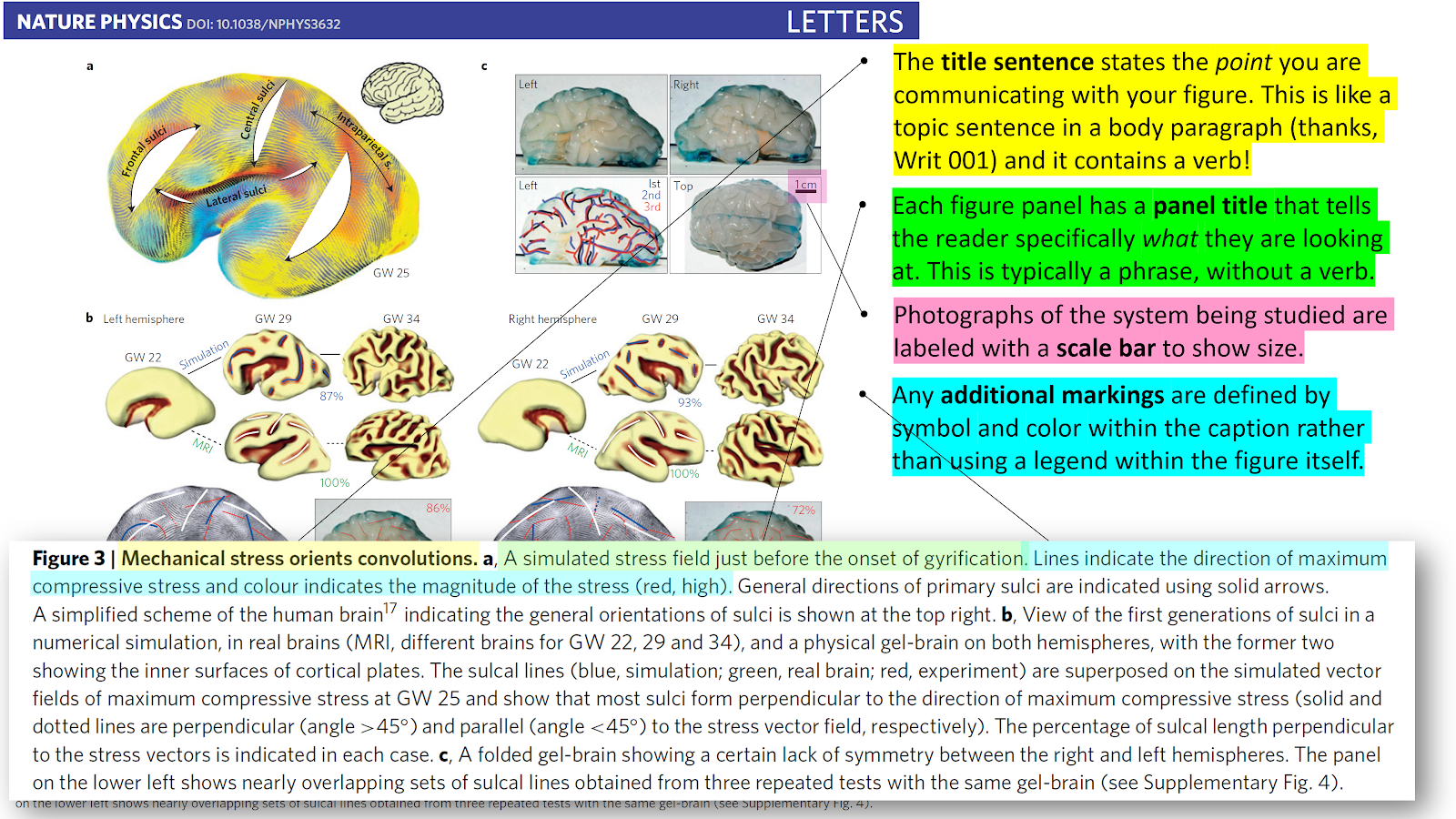
Even figures that don’t have an explicit plot with data points still can present essential experimental data. Often data takes the form of photographs, microscope images, or other specialized images like those obtained from X-ray diffraction or magnetic resonance imaging. This kind of data can play a critical role in showing your experimental results, even without a traditional plot with labeled axes and clearly defined data points.
You will recognize many of the same elements as for a figure with a plot, and some new ones:
In the figure itself
-
Scale bar: Any experimental images (eg. from a microscope) should be accompanied by a scale bar, which provides a sense of the size of the system studied. Usually a scale bar is a plain, thick horizontal line segment in black or white. The length of the scale bar is either written directly above or below the bar, or it is provided in the caption.
-
(optional) Additional markings: If there are any additional symbols or marks in the figure that are not data points, they must be visually distinct (in eg. shape, color) from the images shown in the figure.
In the figure caption
-
Title sentence: This short sentence (with a verb!) explains the point of what is shown in the figure. It tells the reader what your data mean and ideally this clearly connects to the main result (thesis) of the paper.
-
Connection to data The caption must make a direct connection between what is shown in the figure and the claim made in the title sentence.
-
(optional) Panel title: If the figure has multiple panels, each panel gets its own brief title. This is almost always a phrase, without a verb.
-
(optional) Definition of scale bar: If the scale bar length is not shown in the figure, it must be clearly defined in the caption.
-
(optional) Definition of additional markings: If there are any additional symbols or marks in the figure that are not data points, those symbols must be defined in the caption, not in a legend.
Here is an annotated example of a figure without a plot, taken from this article in the journal Nature Physics. Again, this figure consists of many individual panels, some of which are obscured below to allow room for the annotations. To see the full figure in proper context, we encourage you to follow the link above to take a look at the original article.
Click on the image to enlarge in a new tab:
Miniquestion: What’s wrong with this figure?
Click here to open in a new tab
Guide to MATLAB plotting and figure assembly in Powerpoint
In Physics 50 you will use MATLAB to plot your data. To help you get started, we have outlined the essential steps in the MATLAB Plotting + Powerpoint Figure Assembly Guide. There’s also some important information there about how to make your plots and figures easier to read.
Click here to open the MATLAB Plotting + Powerpoint Figure Assembly Guide in a new tab.
Module 1 Deliverable
What do I need to make for Module 1?
For Module 1, your deliverable is a single figure, with a caption, that conveys what you learned from your experimentation. Remember: Experimental science is not about getting the “right” or expected answer. You are trying to make a careful conclusion that is supported by the data you collected. If your data doesn’t support the hypothesis, you should draw a cautious and properly qualified conclusion based on your data.
In your experiment, you explored the effect of mass on the coefficient of static friction, but to give you a sense of what we hope your figure will be like, let’s imagine for a moment that you were studying the effect of location on the inclined plane (eg. cutting board) on the coefficient of static friction. Here’s what a figure about that might look like:
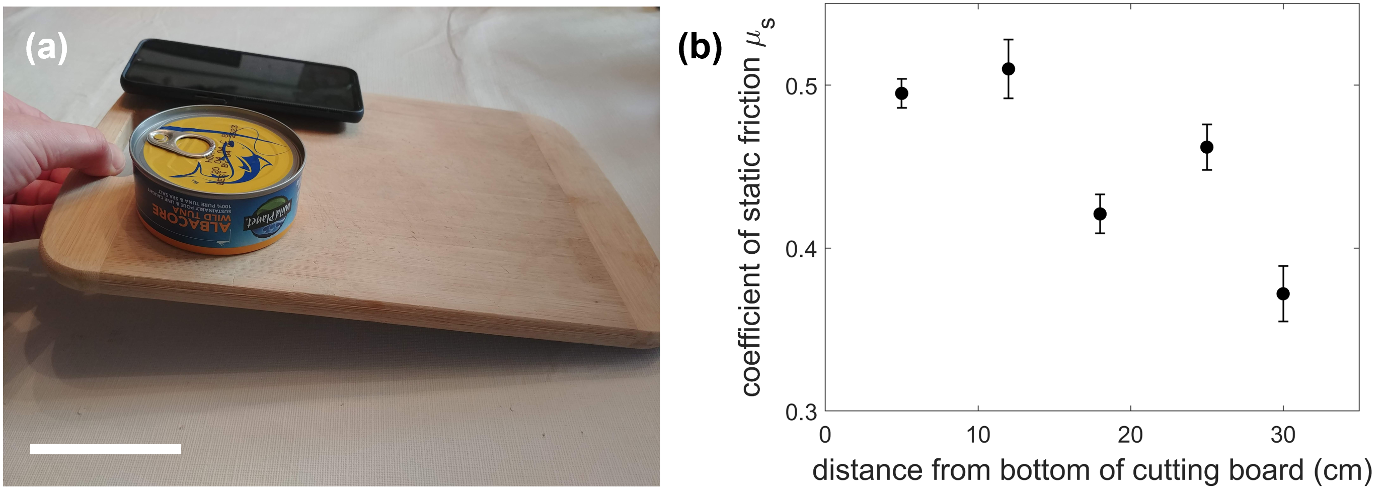 Figure 1. Coefficient of static friction depends on the location of the tuna can on the cutting board. (a) Experimental setup. The coefficient of static friction was determined by measuring the critical angle for two different starting locations of a tuna can on a cutting board. Scale bar: 5 cm. (b) The coefficient of static friction is not independent of position, since the values do not agree within their error bars (standard error of the mean).
Your figure must include:
- Panel (a) featuring a photo of your experimental setup with
- a scale bar placed in a lower corner of the photo
- minimal visual distractions
- Panel (b) showing a plot of your data that includes
- axes, with axis labels, units, and tick marks
- data points, with consistent data point symbols
- error bars, attached to the individual data points
The figure must also include a caption with the following:
-
A title sentence (with a verb) that briefly states what to conclude from the figure
- A description of panel (a), including
- a brief explanation of the experiment
- a definition of the scale bar
- A description of panel (b), including
- a connection to data sentence that directly connects your conclusion to the data shown in the plot
- a definition of the error bars
Can you find each of these elements in the above example figure?
Please upload your figure to gradescope according to the instructions provided there (note that you will have to upload it more than once). Make sure to include both the figure and caption.
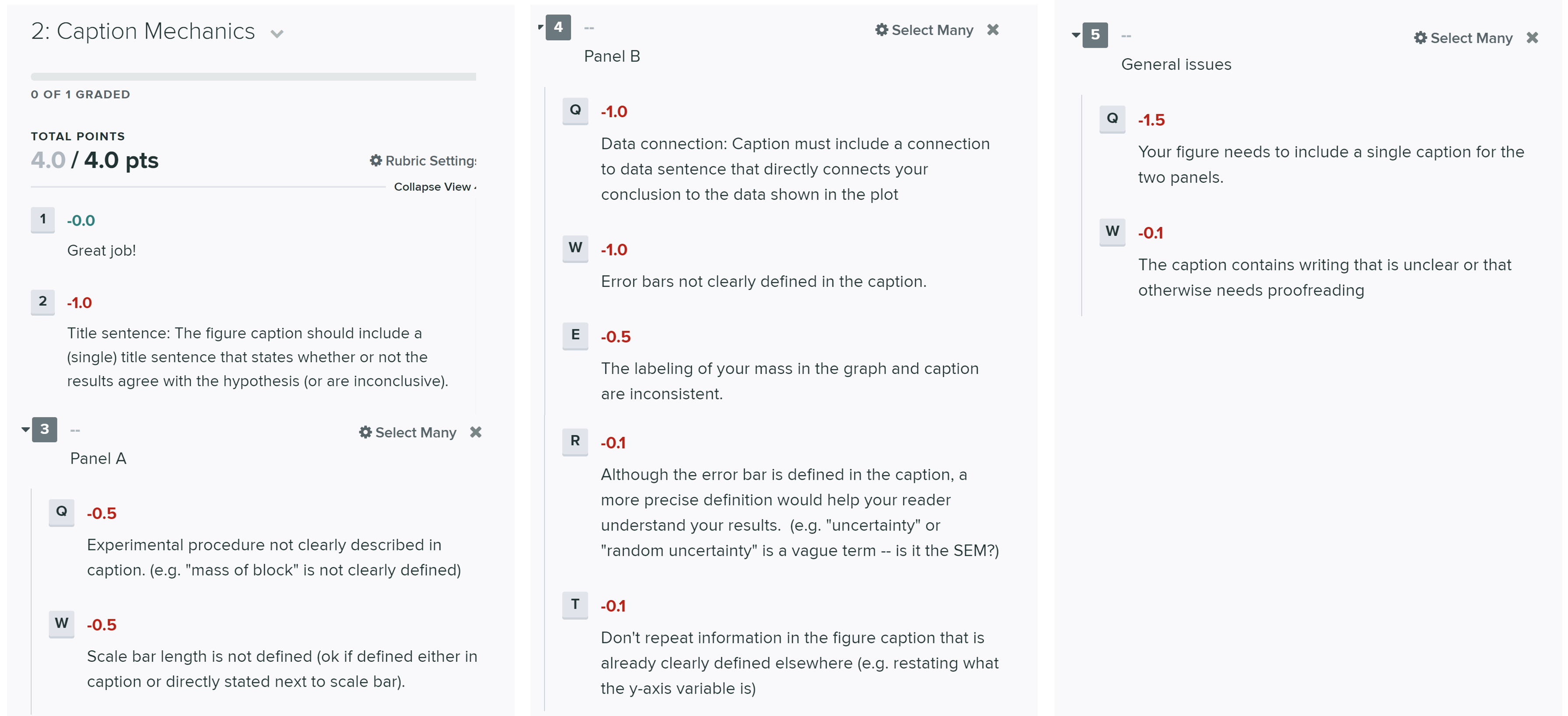
The tentative rubric that will be used to evaluate this deliverable is provided below. Please keep in mind that these rubric items are subject to change as we can never foresee all the issues that may arise. This is meant to give you a sense of how it will be graded.
Click on the below images to enlarge in a new tab:
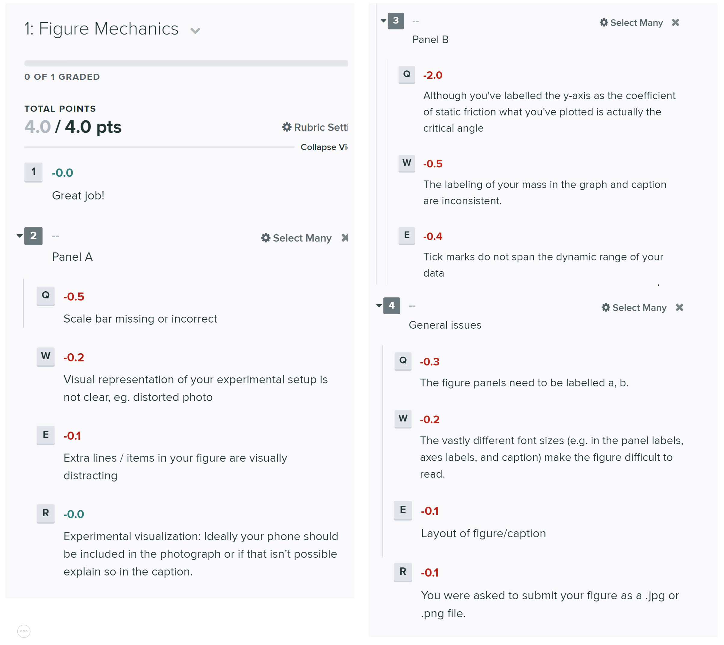
Your deliverable will also be graded for the quality of your data and the conclusions you drew [2 points].
Deductions will also be assessed for failing to submit the checkpoint on time as outlined in the course syllabus.
Don’t forget to double-check that you’ve completed the miniquestion for this week. You can find this week’s mini-question here.